Data Visualisation: The importance of finding the right reporting platforms for our clients

Introduction
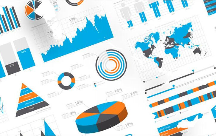
When it comes to visualising data, our end goal is to present actionable insights to our clients that help facilitate a successful marketing strategy. The best way to do this is to create shareable, interactive and visually captivating reports using the right tools for your brief. With this in mind, it’s safe to say there are an abundance of reporting platforms to choose from and finding the right one for you and your client can feel like a bit of a mine field. Therefore, when it comes to tailoring the platform to suit the brief, setting out your reporting goals early can cut out the nonsense and get you well on your way to that perfect live reporting dashboard your clients’ want to see.
Cost
It probably comes as no surprise that one of the most important factors in the tailoring process is the amount it costs the client to get the desired report(s). With so many packages out there it’s important to understand what you get for your money and how that links to the client brief.
Datorama provides our yearly pay-by-rows package. It comes with a more comprehensive list of features and abilities that make for some slick and easily shareable reports, but it doesn’t always mean that this is the best option. Our free-to-use alternative is unsurprisingly Data Studio. It’s highly customisable and has a reasonable collection of API connectors, to get an effective report done. In addition, we use Power BI which is linked to the Office 365 monthly subscription by user. This we use for more internal projects as it’s great for interactivity and insights, but there isn’t a great supply of APIs to choose from and shareability is slightly limited to those who have a Power BI account.
Given the difference in platform offerings, it’s clear to see how there are many factors in addition to cost that help determine the tool of choice…
Audience
Who is going to be using the report? How often will they be using it? What role do they hold in their company? These are some of the crucial questions that need to be asked when planning the structure of a dashboard. If it’s the Financial Director, they might want to see a short, sharp top line summary of their KPI’s with time comparison interactivity and a few small breakdowns of high and low performing ads for example. Where are they making money? And where are they losing it?
In other circumstances the dashboard may need ‘the Full Monty’ treatment with more of a drilldown on campaign performance, keyword rankings and more. Data Studio, we’ve found to be great for a simple, no hassle overview that provides all the insight you need. Datorama on the other hand is our go to for any larger, more detailed interactive reporting, making it easier to visualise large amounts of data clearly and concisely.
Data Sources
The source that we pull the data from plays a key factor in selecting the perfect reporting tool. Most of our client’s will at least need data from Google Analytics and Google Ads to be showing in their dashboard. Considering this, if the reporting platform doesn’t provide any easy connectors and your own script knowledge is somewhat lacking, then most of your data upload work will most likely have to be manual and therefore extremely time consuming. Knowing this, you can picture how a reporting platform could quickly become more of a hindrance to your workflow than a help, so making sure your data sources are well accommodated for in advance will help optimise the efficiency of your report build process.
Design
Creating an effective aesthetic for your client is a fundamental part of delivering a professional report. When it comes down to it, it’s as information designer, Tom Wujec summed up in his 2009 Ted talk; we contrive meaning from seeing and by producing a good graphic, you invite the eye to create a visual logic that makes sense of your data. So, when you’re choosing the ideal reporting platform. Make sure it supports your branding needs first and foremost. It should make it easy to set the colour scheme, add logos and adjust your graphs and charts suitably so you can make a clear, sleek and coherent report. By knowing your audience, you can capture their attention with distinct insights making it easier for them to plan the next steps in their marketing strategy.
For us, Datorama (especially since its latest Data Canvas update) allows for a lot of design customisation compared to some of its competitors with a big plus being the ability to integrate html, CSS and now also JavaScript into the customisation process of your report. In comparison, Data Studio is basic, but the widgets are easily manoeuvrable and fast to customise with good cross-filtering abilities. It’s a useful reporting tool that lends itself to a more infographic style of reporting.
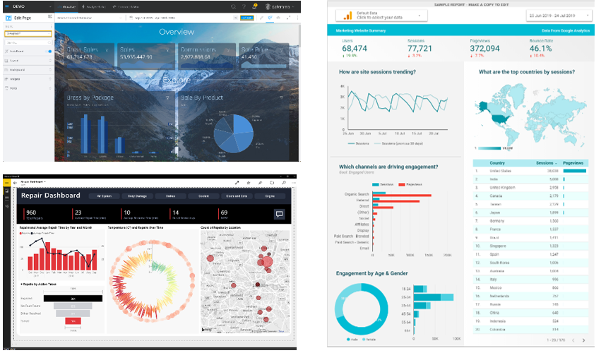
Figure 1: Clockwise from top left – Datorama, Data Studio & Power BI
Data Synchronisation (merge data and sources)
When considering the client and the data they need to track, it’s almost guaranteed that you’ll need to create classifications to unify data based on different dimensions in your data e.g. Campaign Name or Ad Group Name etc. This is often so that the metrics you’re tracking tell a more comprehensive story in relation to products, services or maybe even locations. So, it’s important your software makes this amalgamation process as easy and seamless as possible because it can be easily misjudged and end up taking much longer than you expected to create.
For us, Datorama makes it easy to create custom dimensions using formulas or creating a VLOOKUP in the data mapping, enabling the system to grab the classifications it needs. Due to a very recent update, you can now drag and drop your classification file into the harmonisation tab for all your data streams to pull the classifications from, so any client with a large amount of data is accommodated for. Data Studio also allows for custom dimensions and blended datasets, but they both have their limitations, so it’s worth investigating before settling on a platform.
Conclusion
So, in summary, when planning that all-important performance report, it’s crucial to make sure the platform you use fully supports and streamlines all your client’s data needs by asking these 5 key questions:
- What is your client’s budget?
- Who is going to be using the report?
- How many channels need to be included in the report and what data sources will need to be connected?
- What level of customisation do the reports need and how interactive should they be?
- Does the data need processing (new classifications) and how easy will the platform make it for you to achieve this?
Sources:
https://masterytosuccess.com.au/3-ways-the-brain-creates-meaning/
https://datorama.com/
https://marketingplatform.google.com/intl/en_uk/about/data-studio/
https://powerbi.microsoft.com/en-us/
https://datastudio.google.com/u/0/reporting/0B_U5RNpwhcE6SF85TENURnc4UjA/page/1M/preview
https://support.datorama.com/en/support/solutions/articles/4000126017-data-canvas-themes